Home Screen
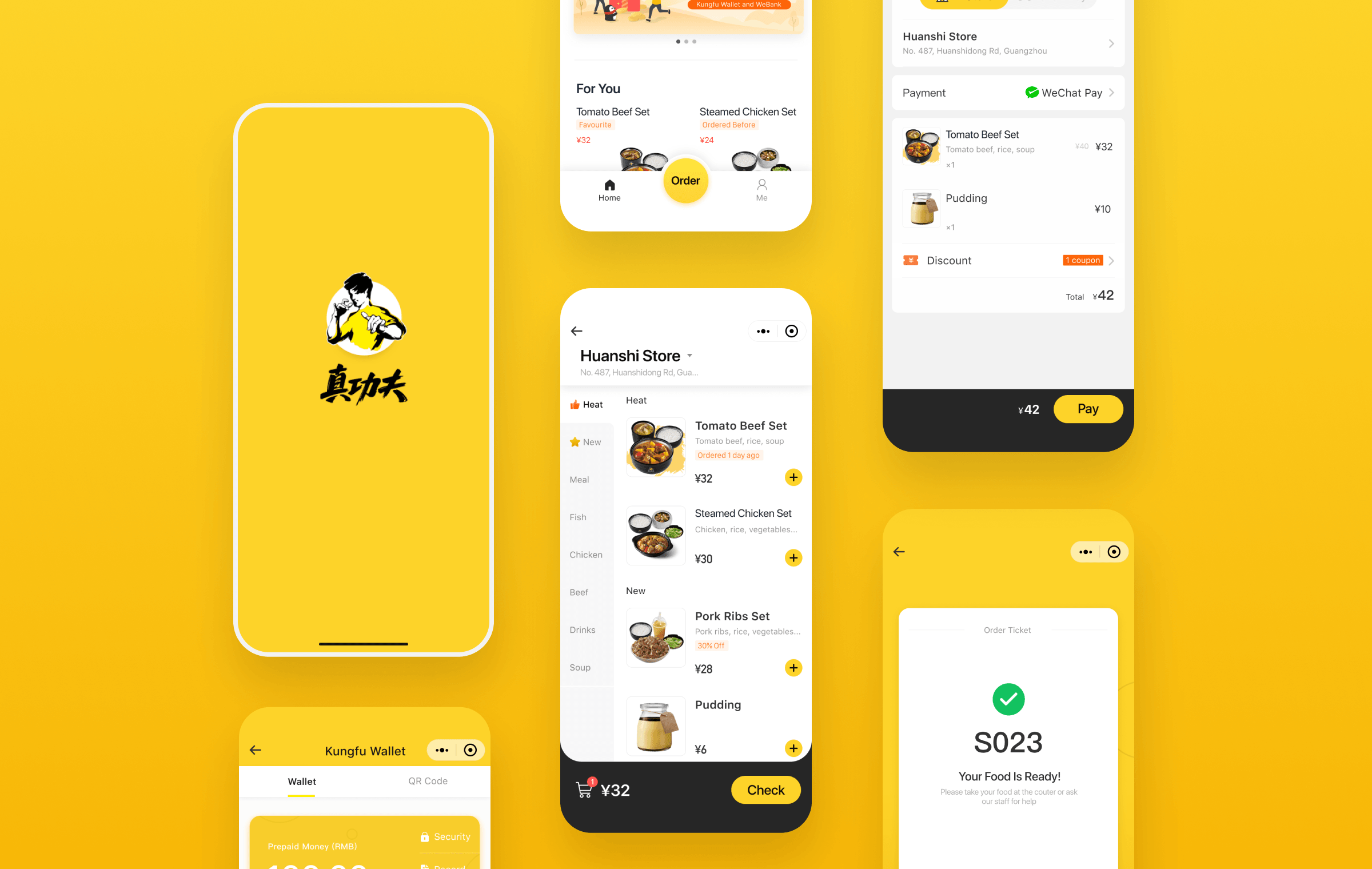
The order status would pop after submit, allowing users to check it anytime. Recommended food would show one’s favourite to help accelerate decision-making.
Kungfu Restaurant is a Chinese fast-food restaurant founded over 25 years. It provides premium quality meals and services through the standardization of Chinese food production, which makes it the only local company in the top five in the fast-food market.
As the company continued to grow, Kungfu needed to keep up with the trend of digitalization in China and provide a better dining experience to gain more customers and a better reputation.
🏆 This project received WeChat Smart Retail Award 2018
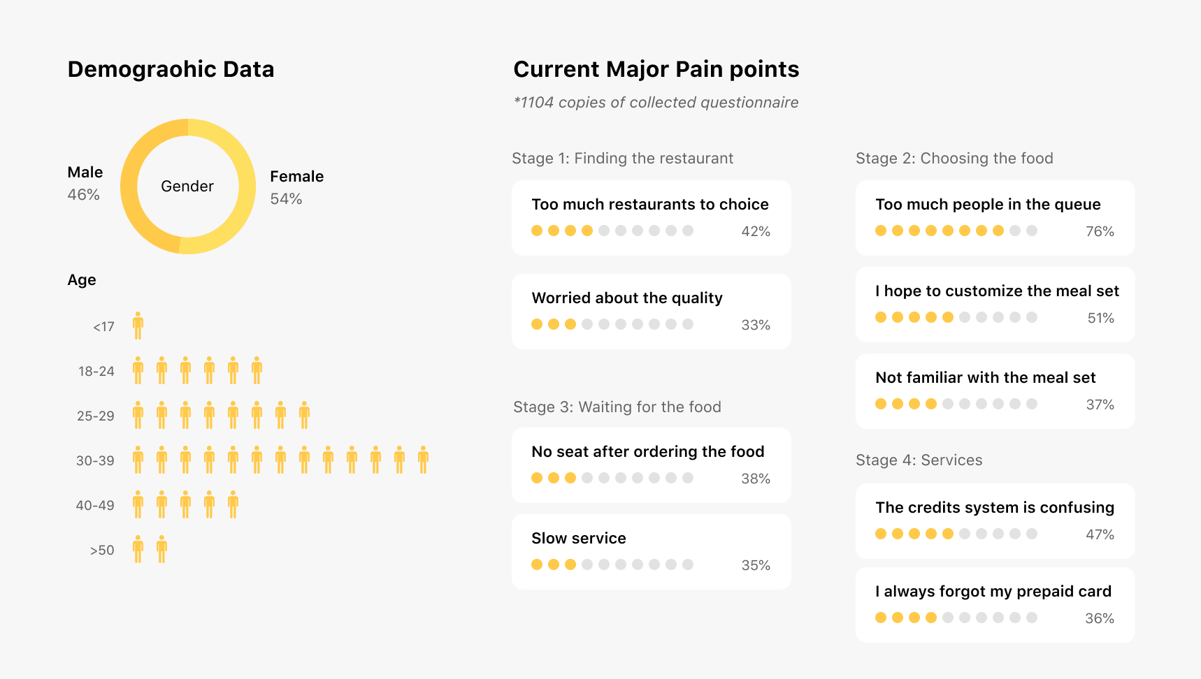
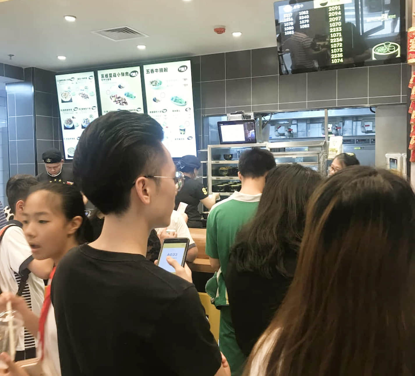
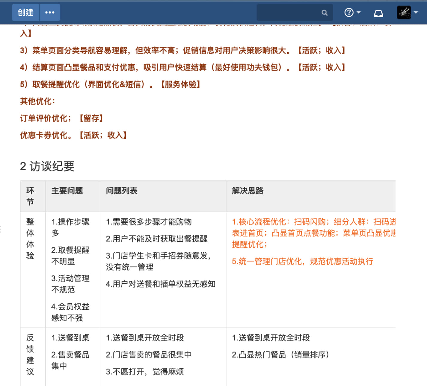
With the help of the marketing team, we collected more than 1,000 questionnaires and highlighted demographic, user flow and major pain points, in which we discovered:
1. The customers were diverse in age. Most users age between 30-39, which are older than other digital products. So our product needs to be simple and straightforward.
2. Most pain points lied within ordering engagement, which covers waiting in a queue, reading the menu and getting the food.
3. Our client hoped to get better digital retail strategies. Creating a digital profile for each customer and recommended menu would deliver higher business value.
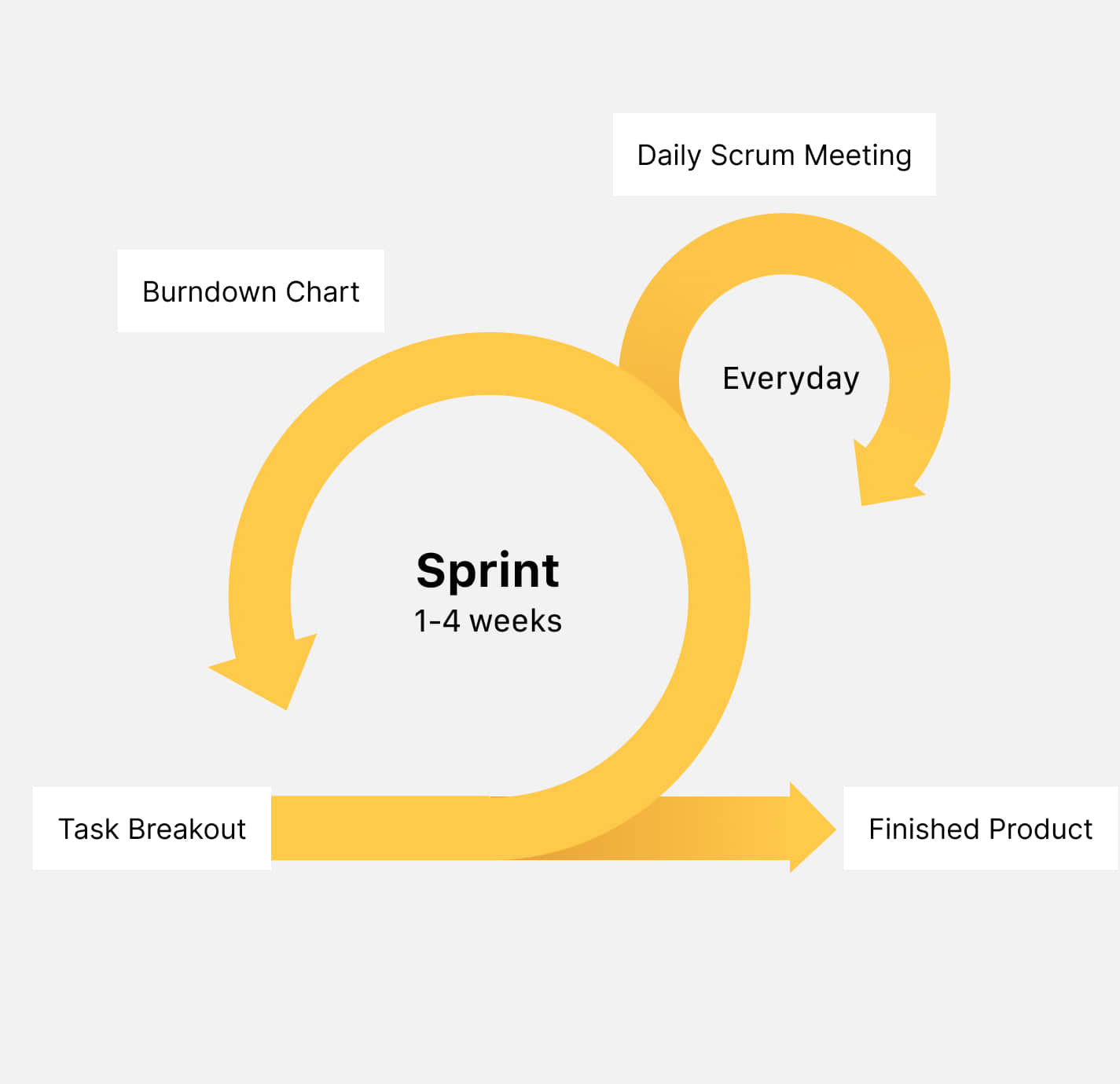
We applied the method of lean product and agile development focusing on building minimun variable products. As the lead designer, I needed to deliver the design with rapid prototyping and usability testing. Our first MVP shows that 20-50% users prefer online-order, especially those around the CBD and shopping malls. More over, less POS are needed in the restaurants because our solution helped ease the heavy burden of operation.

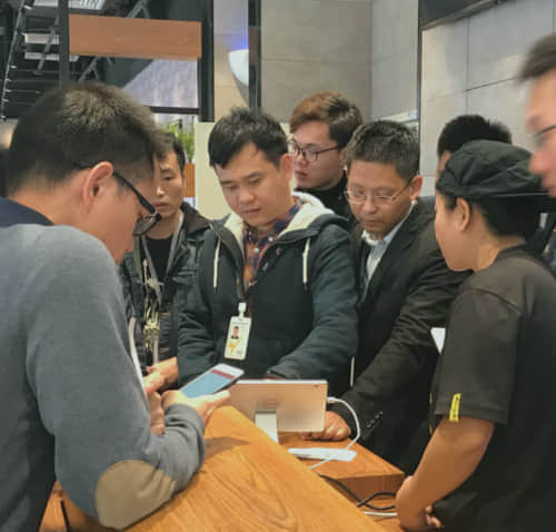
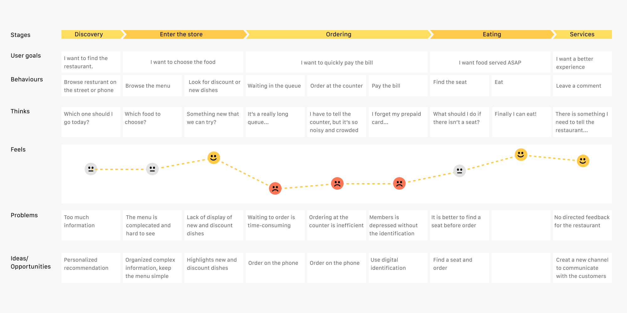
While the company popularized the service to more restaurants around the country, we have access to overwhelming user data. We combined user observation, interview and behaviour analysis to expose further problems:
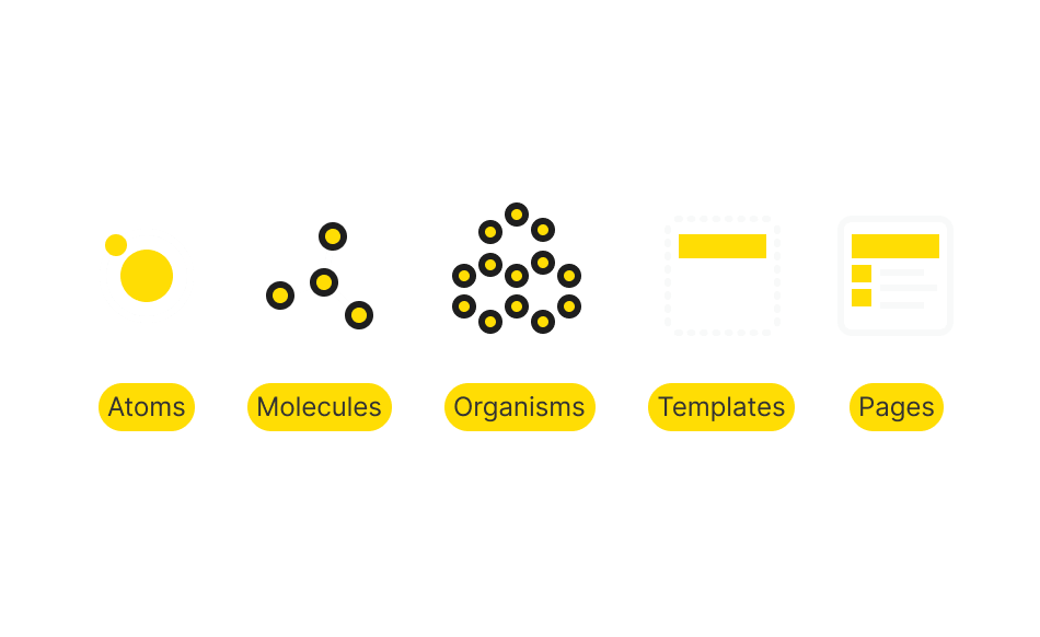
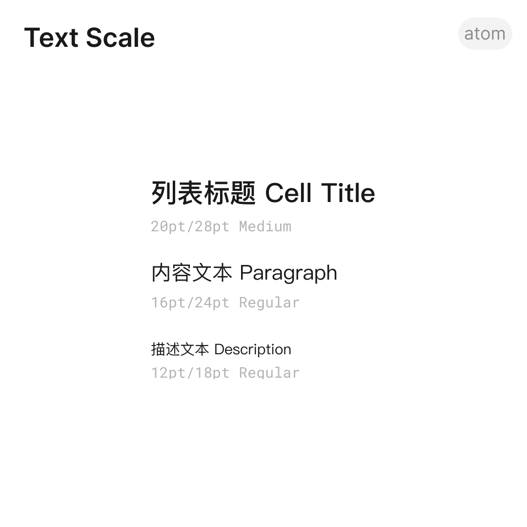
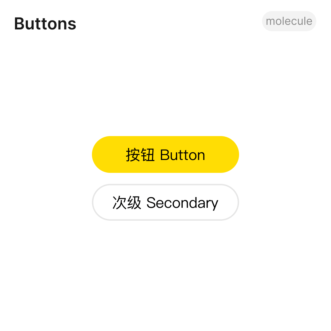
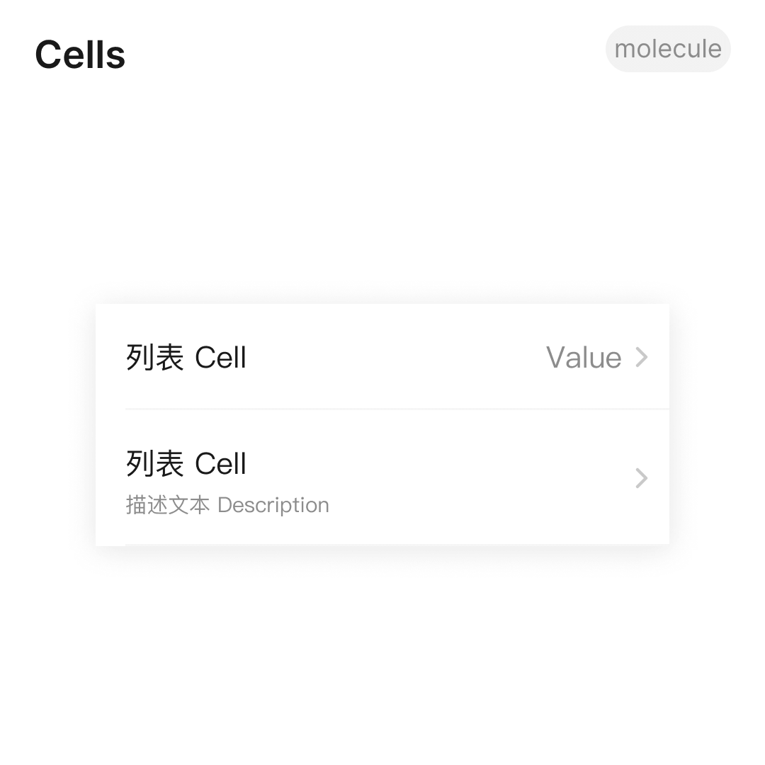
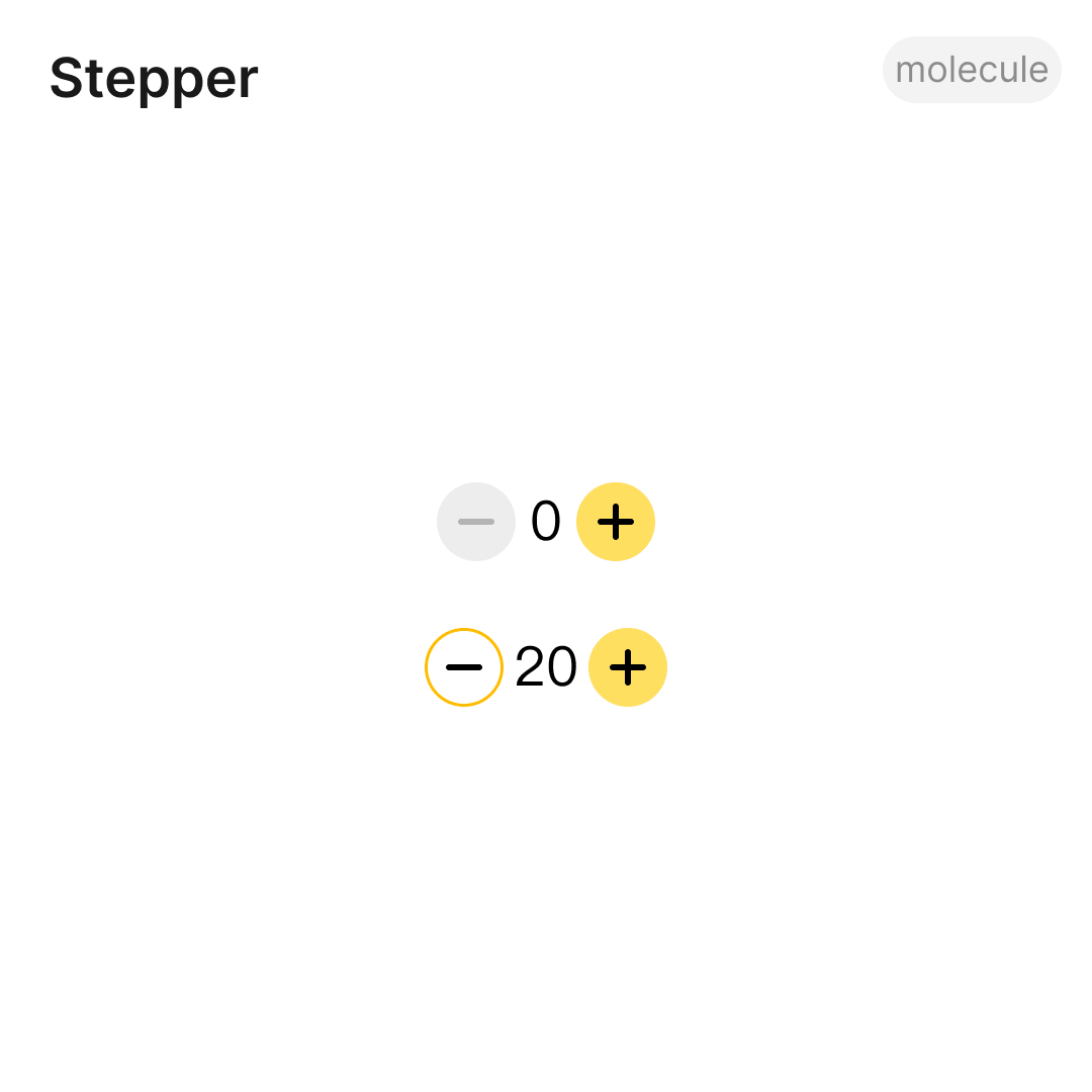
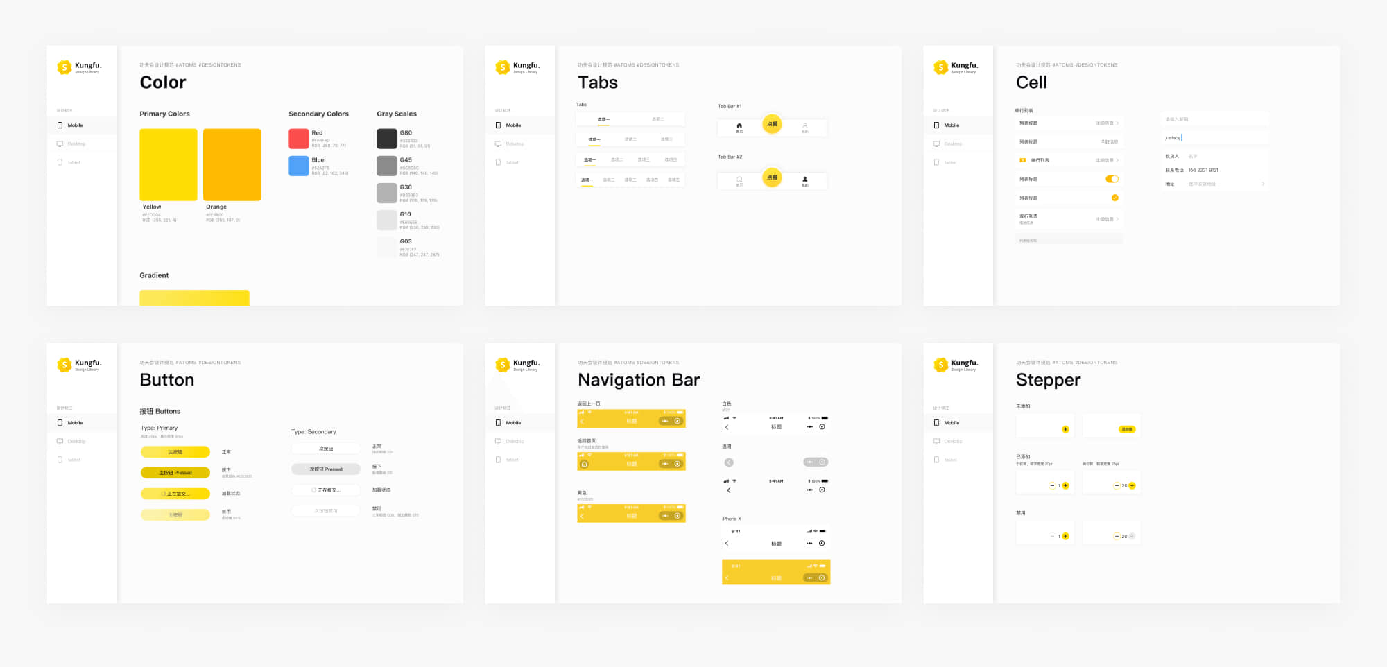
I used the frame of the Atomic Design System and rebuilt all the UI elements to formulate consistent interface and experience. Collaborating with engineers, we implemented every design tokens, components and templates to maintain a cohesive design during fast scaling.
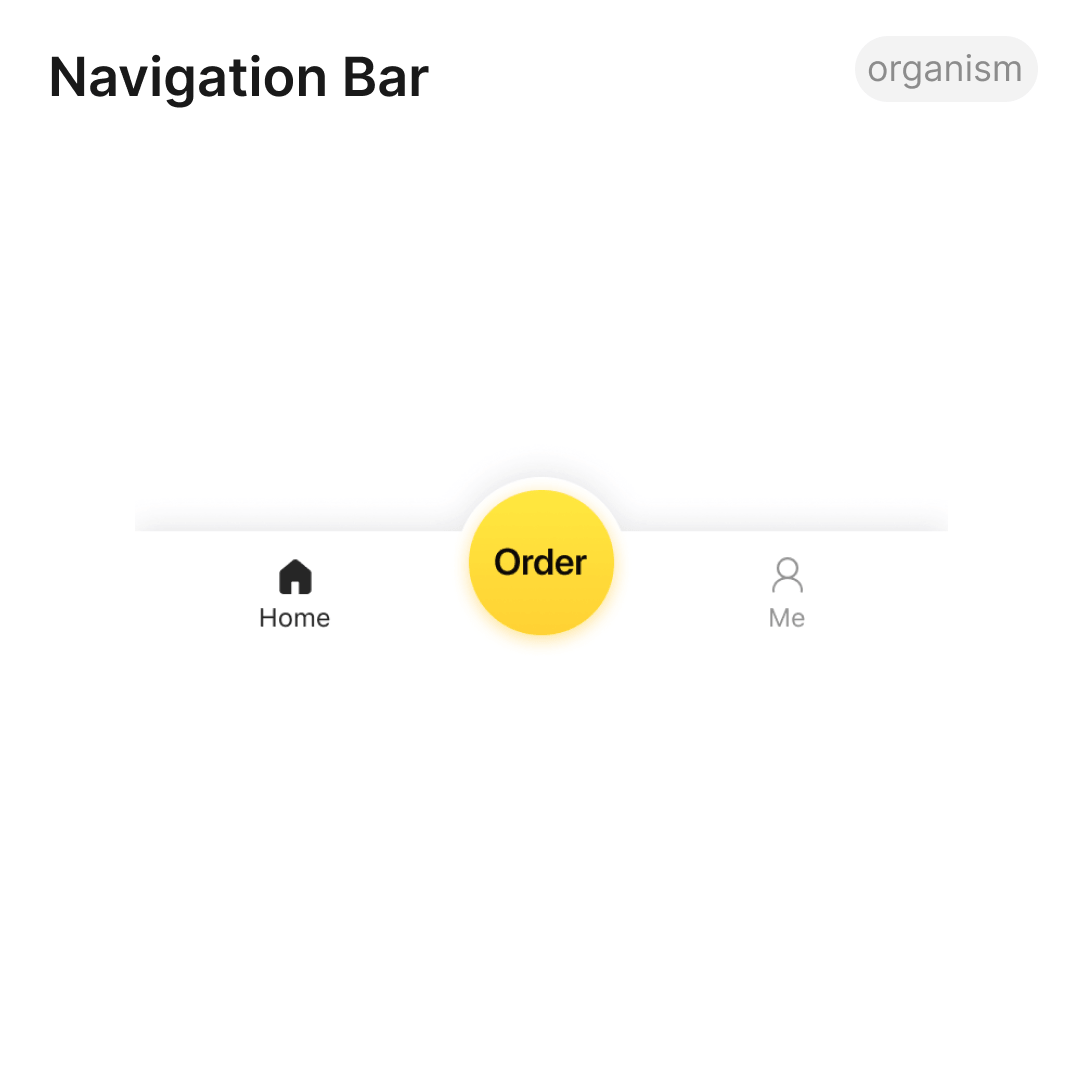
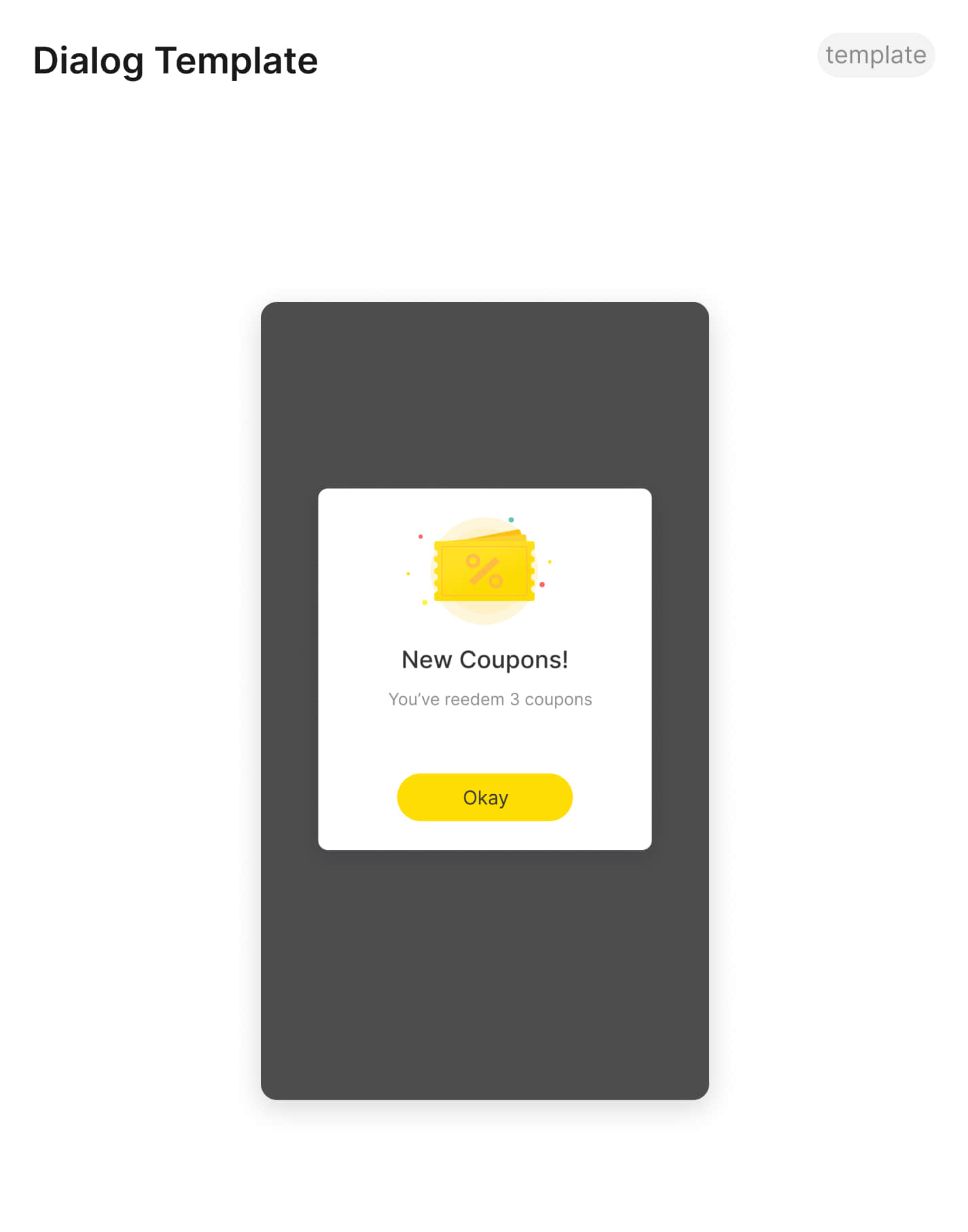
The order status would pop after submit, allowing users to check it anytime. Recommended food would show one’s favourite to help accelerate decision-making.
We enhanced the menu with organized catalogue and intuitive customizing meal sets based on the mental model we discovered from card sorting. It is an example of how motion provides meanings.
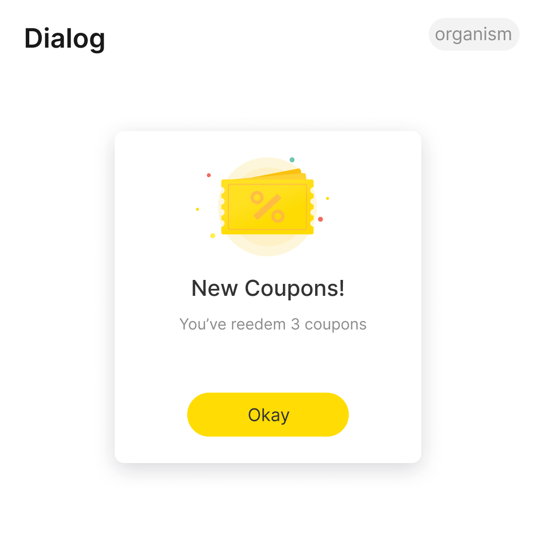
I tried to promote recharge in the purchase process and provided an appropriate option related to the current bill — this change contributed over 30% conversion rate and gained more user retention.
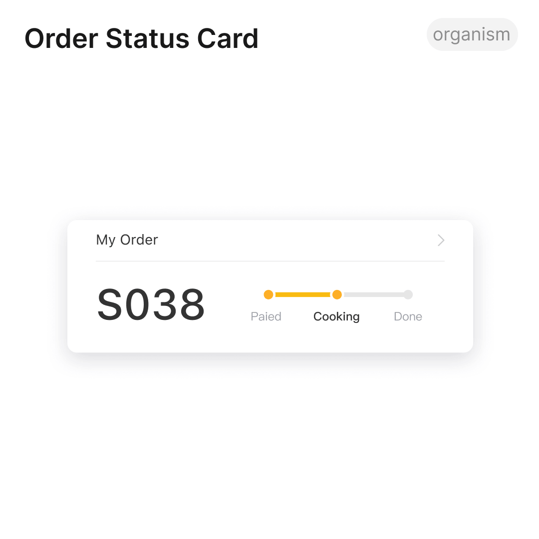
Inspired by the bordering pass, I redesigned the order screen. The customers could be aware of the process at any time. Large number increased legibility when showing their phone to get the meal in a noisy environment.
After the improvements, the overall user retention grew to over 55% while the service was expending. The average time of order takes only 2 minutes, which brings us 89% of customer satisfaction. We delivered both integrated services and the concept of digital operation to our client.


Data-Inspired design: I learned how to measure user experience, and the combination of both data analysis and interview give me a whole picture of macro and micro user experience.
Design system practice: I tried to introduce a design system in the project, and it did not just improve the quality of the product, but also saved a bunch of time for both designers and developers.
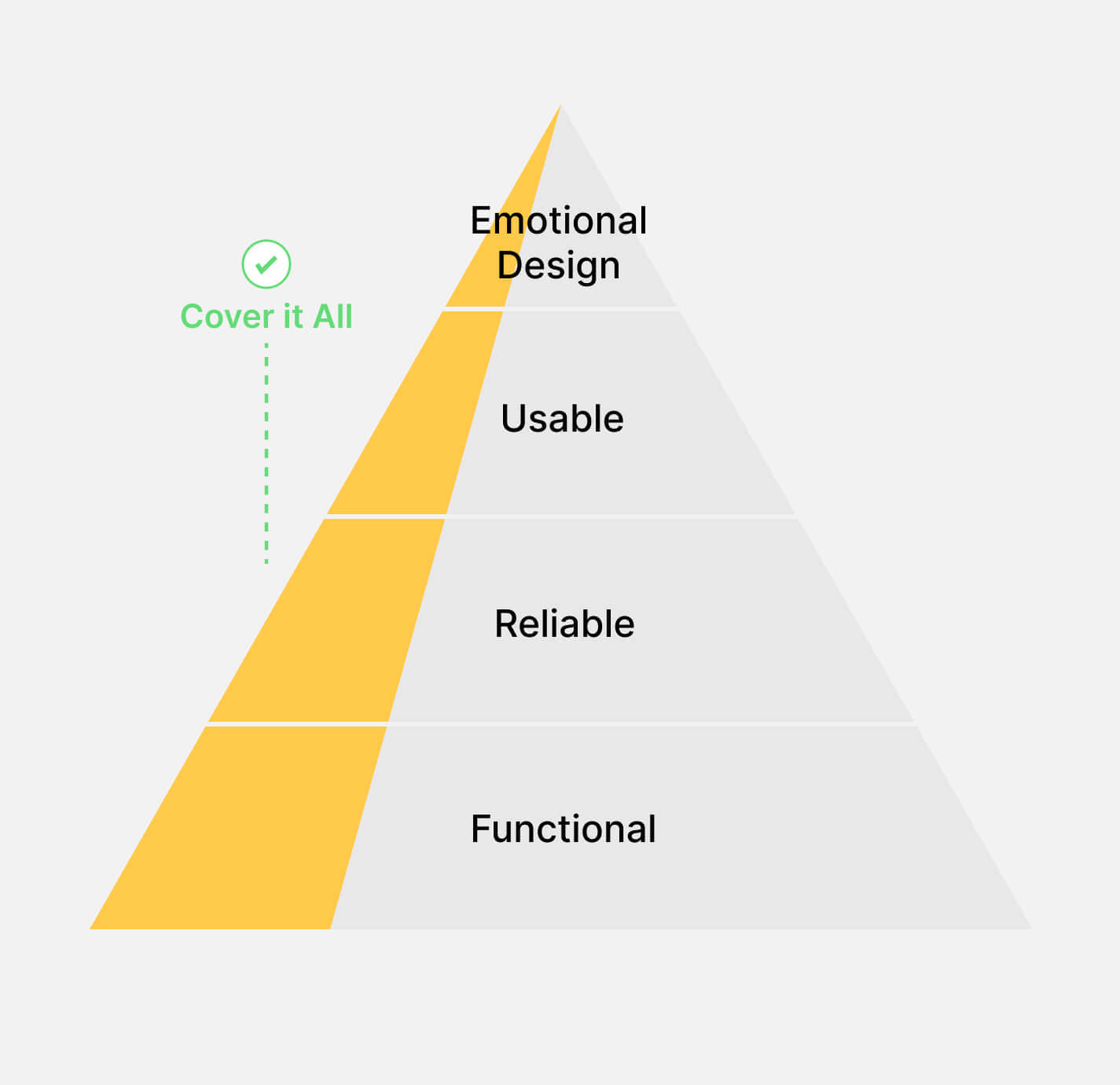
How design contributes business values: At the very beginning, the company focused more on profits. Design was just an inessential part. I tried a lot to communicate the role of design in building a great product and brand. To do that, I have to answer to myself first.
Special thanks to the product team who support me as a design lead for the first time!
真功夫作餐饮集团已经发展了 25 年,凭借高品质、高标准化的中式快餐,成为中国快餐五强中唯一的本土品牌。随着市场发展,真功夫品牌需要数字化转型,提供更好的用餐体验,获取高增长和声誉。因此我们与真功夫合作开展了这一项目,重新构造一套全渠道数字点餐和营销方案。
🏆 此项目获得 2018 微信年度智慧服务奖
与真功夫的市场市场部门合作,我们在项目初期进行超过 1000 份问卷和访谈,给现有顾客进行人口学、体验流程和痛点分析。我们发现:
项目使用精益产品(lean product)和敏捷开发(agile development)思维。作为主设计师,我需要推进小团队进行快速原型和可用性测试,在每个迭代交付最小可行性产品(minimun variable product)。在早期版本中,20% - 50% 的顾客转为线上点餐,认为这更符合上班族节奏,同时项目试点门店表示效率大大提高,甚至可以减少传统点餐 POS 的资金投入 ,进一步肯定了「问题-方案匹配」。
随着产品推广到全国各地和用户数量增加,项目也进入迭代和增长阶段。我们的产品团队开始定期到餐厅进行反馈收集,以及结合后台数据进行行为分析,同时也发现了新的问题:
借用 Atomic Design System 框架,我在中期重构了所有 UI 元素,并推进设计和开发团队在产品中将 tokens、组建和模板逐步替换,在项目拓展期提供一致、简洁、符合品牌调性的设计。
顾客完成点餐后,订单信息会在首页弹出,方便随时查看餐品的状态和取餐。推荐栏目也能显示顾客喜爱的餐品,加快决策。
菜单结构根据「卡片分类」调研重新分类。定制套餐流程使用了底部弹出卡片搭配动效,希望符合直觉、保持轻盈,减少操作时间,提升完成率
产品在付款时推广钱包功能,并根据订单价格提供对应的充值金额建议和优惠券。这一场景化的设计在推出时贡献了超过 30% 的使用率,成为后来常驻的增长策略之一
顾客需要在拥挤的餐厅下展示订单信息。因此我以登机牌为灵感,强调订单号码,注重店员在吵杂环境下可读性,并证明能有效提升顾客和餐厅的沟通效率
经过持续改进,顾客平均下单时间少于 2 分钟,产品留存率也提升到超过 50%,月度活跃用户 100 万。在这个项目里我们为客户提供了高满意度的产品,以及配套的全渠道数字化零售方案。
数据驱动设计:结合访谈、观察和行为数据分析,我实践了从宏观和微观多方面进行用户体验度量和设计论证
建立设计系统:在多平台、快速迭代的项目中,引入设计系统可以提升产品设计一致性,给设计和开发团队避免大量重复工作。但良好的设计系统落实需要每个人的力量,其中设计师扮演着重要的推动角色。
设计如何创造商业价值:项目初期,团队将设计定为辅助部分。但随着时间推演,设计团队在工作中逐渐摸索和证明优秀的用户体验对于创造商业价值有着重要的贡献。